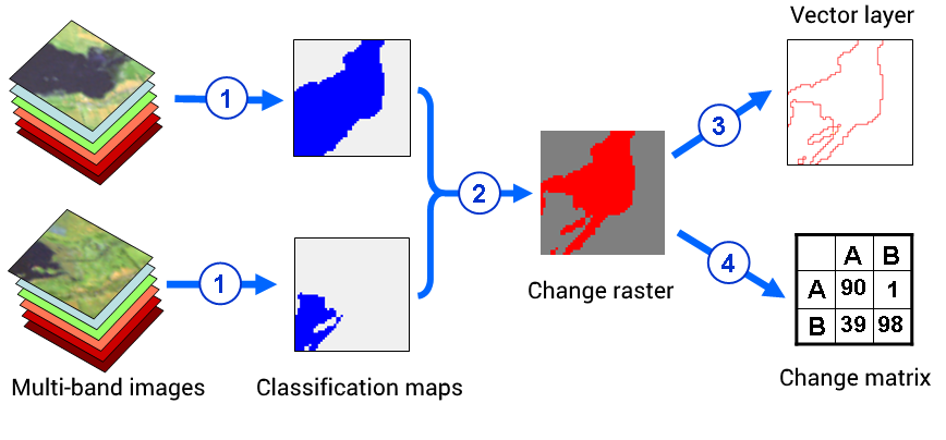
This post is already the third one from a series of methods for automated change detection. Both past posts talked about different ways of directly comparing multi-temporal satellite images. But you can instead compare the thematic classification maps that are created separately for each image. The general scheme for finding changes by comparing multi-temporal classification maps is shown in Figure 1.
Theory
At the first stage, the classification of images and postprocessing are performed. For each date, you can use the same classification algorithm with the same settings, or you can customize the method for each day. You can also use different classification algorithms for images of different dates. The main thing here is to ensure a high quality of the classification.
After receiving the classification maps, they are compared and different combinations of classes for the first and second dates are distinguished, as well as areas that have not undergone any change. Modern software allows you to do this comparison in automated mode. The practical aspects of this process will be described in the second part of the post. The comparison results can be displayed in the form of a raster image or a vector layer, or as a table showing the redistribution of pixels between classes.
Fig. 1. The general workflow of change detection using classification maps
Finding changes based on the comparison of multi-temporal classification maps has one big advantage – it allows you to do without radiometric calibration and atmospheric correction. These procedures are needed to correctly compare the spectral brightness of the pixels. They are also needed when we compare the quantitative indicators calculated on the basis of the brightness of image pixels, such as vegetation indices. But when we compare the classification maps, we compare the quantitative rather qualitative characteristics. This removes the need for radiometric calibration and atmospheric correction.
In order to find changes effectively, two conditions must be met:
– high accuracy of classification,
– the same classification accuracy for two dates.
If the first condition is not met, then we will have low accuracy of the identification of the changes. For example, we might not be able to find a change, because for the two selected dates the objects that were subject to change were not classified. If the second condition is not fulfilled, then we may mistakenly identify the changes. The changes found will not correspond to the changes in the field, but rather to the classification errors.
Practice
Let’s look at the comparison of thematic classification maps in the ENVI on the example of the assessment of the change in the area of the Murom reservoir. Murom Reservoir is located in the Kharkiv region. It is located on the Murom River and begins below the Vesele village. The dam of the reservoir is 4.5 km away from where the Murom flows into the Kharkiv River near the village of Ruski Tyshka.
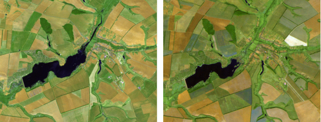
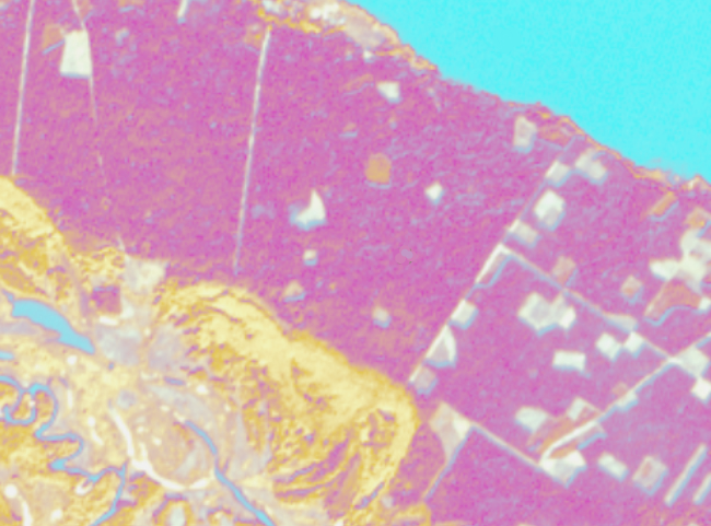
The water reservoir was established in 1978 to irrigate agricultural land. It was also one of the backup reservoirs for water supply for the city of Kharkiv. The entire history of the reservoir and landscapes around it can be traced back to the images of the satellites of the Landsat mission, which began in 1975. For our example, we take two images of Landsat 5 TM from May 17th, 2000 and September 18th, 2007 (Fig. 2).
Fig. 2. Landsat 5 TM image composites (band combination 7: 5: 3). On the left is the image taken on May 17th, 2000, on the right is a photo taken on September 18th, 2007
When we look at the images, we see that the area of the water surface has decreased. This may be due to long-term changes in the reservoir. And it may be due to only the seasonal dynamics of precipitation and temperature in 2007. It is also possible that the reduction of the reservoir area arose as a result of the artificial drainage of water from it. Now, we will not be looking for a cause for change, we will focus on mapping these changes.
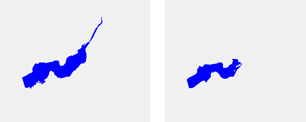
In both cases, two classes were classified – the water and everything else (Fig. 3). Subsequently, at the stage of postprocessing, small water bodies were removed and only the reservoir remained on the classification maps. We will have a look at the automatic comparison of these classification maps.
Fig. 3. Classification maps for 17.05.2000 on the left, and 18.09.2007 on the right
1) So start the comparison procedure for the classified maps go to the Toolbox and choose Change Detection → Thematic Change Workflow (fig. 4).
Fig. 4. Tools for comparing multi-temporal data in ENVI’s toolbox
Thematic Change wizard will appear. Here, you will need to set up the procedure of change detection going from one window to the next. The process consists of four steps:
– data selection
– setting up a legend for the change map
– setting up results generalization,
– setting up the save option.
2) The first step interface of Thematic Change window is shown in Figure 5. The window has two tabs. In the Input Files tab specify the data to compare. There are two fields for this: Time 1 Classification Image File and Time 2 Classification Image File. To select the necessary data, you need to click the Browse … button to the right of the corresponding field. In the second tab (Input Mask) you can specify a processing mask. This is optional. By default, the comparison of the classification maps is performed without a mask.
Fig. 5. The first step of comparing multi-temporal classification maps is the choice of data
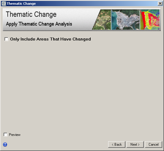
3) In the second step, you need to configure the map legend. This is done by checking the Only Include Areas That Have Changed check-box. If you do this, then the change map will have a separate color for each area that had changed. And all unchanged pixels will be marked with the same color regardless of the class to which they belong. If you do not tick this box, the change map will have a separate color for each class transition. But for pixels that had not changed, it will also have different colors, depending on the class to which they belong. In this example, we use this option (Fig. 6).
After performing the second step, a change map appears in the table of contents. But so far this is not the result. This is just a temporary preview image. If this image does not meet your needs, you can click the <Back button and change the settings in the previous steps.
Fig. 6. The second step of change detection – legend settings
4) The third step is used for generalization. ENVI offers two methods of generalization – smoothing and aggregation. Smoothing simplifies the boundaries on the map. Aggregation reduces small areas on the change map.
You can use either method or none at all. An example of the last option can be seen in Figure 7. To select a method, you need to check the appropriate box. For smoothing – Enable Smoothing, for aggregation – Enable Aggregation. The degree of generalization can be adjusted using the numeric value in the corresponding input line.
Fig. 7. Generalization settings
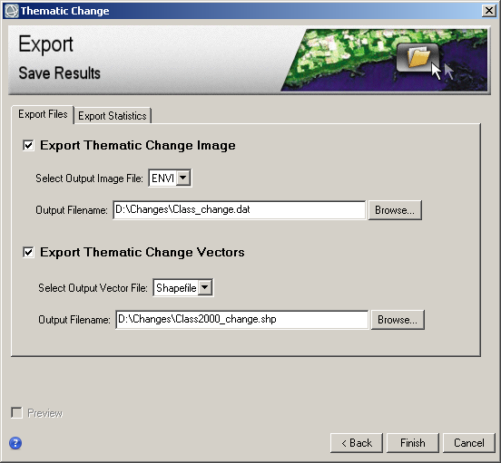
5) The Thematic Change window in step four is shown in Figure 8. Here, the two tabs contain options for saving results. The first tab (Export Files) contains options for saving results in graphical form. The map of changes can be saved in a raster format and in a vector format. Raster data is stored in the ENVI img format. Vector data is stored in a shapefile format. In the table of attributes, ENVI creates three fields – the class for the first date, the class for the second date and the area in square meters.
The second tab (Export Statistic) allows you to save in txt format a table that shows the redistribution of pixels between classes. This table is also called the change detection matrix. It has as many lines as there are possible combinations of classes for the first and second dates. There are four columns in the table: class for the first date, class for the second date, area in square meters, and percentage of the total area. After making the settings in the fourth step, you can click the Finish button.
Fig. 8. Step four – saving the results
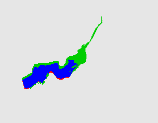
6) The results of the automated change detection are shown in Figure 9. The unchanged area of the water body of the change map has the color blue, the unchanged area of other objects is gray. Pixels that have ceased to belong to the water surface are marked in green. Pixels that have changed to the water class are marked in red.
Fig. 9. Change map and the change matrix
From the change matrix (Fig. 9, right) we can make quantitative estimates of changes. At the normal reference level (according to the design documentation) the area of the Murom reservoir should be 4,08 square km. According to the decryption of satellite images, the water storage area had an area of 3.83 km2 in 2000 and 2.28 km2 in 2007. For the second date, the area is less than the first by 40%.

